There’s a Big Problem with iOS 18’s Amazing Customization Features
- Home
- There’s a Big Problem with iOS 18’s Amazing Customization Features

There’s a Big Problem with iOS 18’s Amazing Customization Features
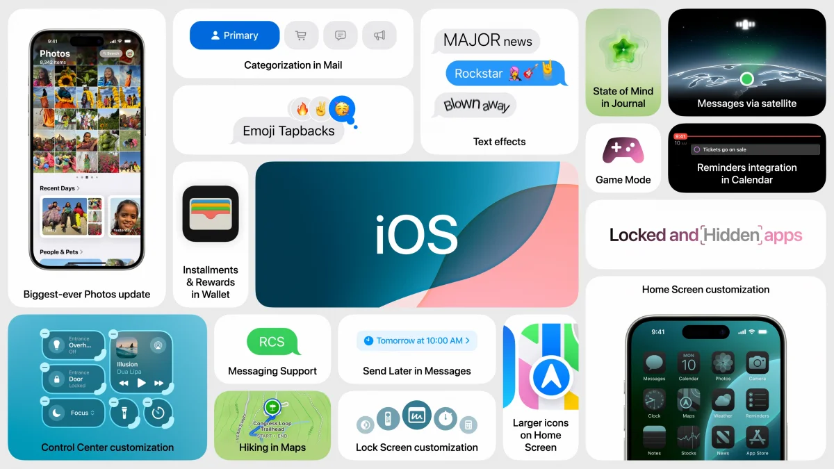
There’s a big problem with iOS 18’s amazing customization features, despite the exciting changes Apple introduced during its Worldwide Developer Conference (WWDC) 2024 keynote. Apple’s proclamation that “the home screen is truly your own” marks a significant shift from the traditionally rigid design of iOS, making it more like Android and creating a mix of excitement and concern among users.
Making iOS More Like Android
When Apple first hinted at more customization options for the iOS home screen, there were mixed reactions. iOS 18’s new features allow users to customize app icon numbers, placements, colors, and even the icons themselves in Dark Mode. The lock screen now supports custom icons, and the Control Center offers additional panels and buttons, much like Android’s widget screen.

These changes bring iOS closer to Android, with features like resizing icons, developer-created app controls in the Control Center, and a Magic Eraser-like tool in the Photos app. Apple has even introduced an iPhone wireless mirroring tool, a common feature in Android phones. With months to go before iOS 18’s official release, more Android-like features are likely to emerge.
With Great Power Comes an Ugly iPhone
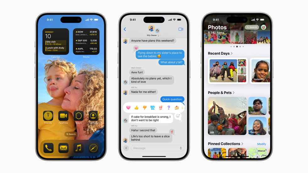
While the new customization options are enticing, they also bring potential downsides. The ability to rearrange apps, expose more wallpaper, and customize the Control Center is appealing. However, the freedom to change app colors to match or complement the wallpaper can lead to visually unpleasant results.

Apple’s presentation showcased various customization possibilities, but some examples, like the red, blue, and purple themes, were visually unappealing. The classic iOS layout remains more legible and professionally styled. The new color tool’s power is too much for most users, leading to potentially hideous home screens without careful consideration.
Apple Knows What I Mean
Apple’s examples highlighted the need for creative restraint with the new customization tools. Brands like Nothing, with its monochrome look and Android-inspired customization, show that default options often look best. Apple’s original color scheme, compared to customized versions, underscores this point.
Users should experiment with the layout of apps and widgets, but use the color tool cautiously. Without careful use, iOS 18’s customization features can lead to a cluttered and visually unappealing home screen, detracting from the iPhone’s overall aesthetics.
Also Read >>> 2024 BMW i7 eDrive50 Review: The Pinnacle of Ultimate Luxury
- Share
